
Common Ekahau Survey Mistakes That Lead to Bad WiFi Designs
The problem with a “good looking” Ekahau file
A polished Ekahau project can still describe a bad wireless design. The floor plan can be attractive, the heatmap can be green, and the report can look complete while the data underneath it is too thin, misplaced, or disconnected from the way the building actually works. That is where many WiFi designs go wrong: not because Ekahau is weak, but because the survey process did not capture the right evidence.
PacketScout sees this most often when a survey is treated as a drawing exercise instead of an RF measurement workflow. Ekahau is the notebook and analysis platform. The result still depends on floor plan preparation, Sidekick placement, walking discipline, client requirements, notes, and the way findings are translated into AP placement, power, channel, and cabling decisions.
This Field Note walks through the mistakes that make an Ekahau survey less useful for real design work. Use it as a review checklist before you trust a heatmap, approve an AP layout, or hand a report to a cabling team.
Mistake 1: trusting a floor plan before proving the scale
The first bad design can happen before anyone starts walking. If the floor plan scale is wrong, every predicted cell size, AP location, attenuation boundary, and walking position is shifted. A ten percent scale error may not look dramatic on a laptop screen, but it can move AP recommendations by multiple rooms or several rack aisles.
A reliable workflow starts by checking known distances. Door widths, hallway lengths, column spacing, rack-bay spacing, conference-room dimensions, and warehouse grid lines are useful anchors. If the plan was exported from a PDF, screenshot, CAD layer, or old construction set, do not assume it survived the export path correctly. Crop extra borders, remove irrelevant sheets, and verify the scale against at least one field-measured distance.
For multi floor work, verify each floor independently. Different drawings in the same building set can have different cropping, scale, north orientation, or renovation history. The survey file should represent the building you are measuring, not the building somebody planned years ago.
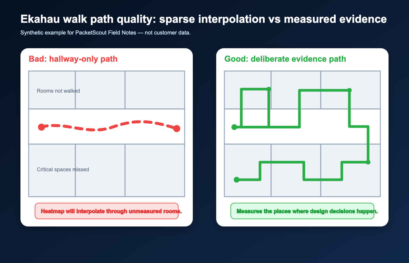
Mistake 2: walking too little and letting interpolation fill the story
A heatmap is not a photograph. It is a model built from measurements, assumptions, and interpolation. If the walk path is sparse, the software has to infer too much. The result may look smooth, but it is not the same as measured evidence.
Long straight-line walks through open areas can miss conference rooms, corners, labs, stockrooms, mechanical spaces, shipping areas, and high-use client zones. In warehouses, walking only the main aisles can miss rack shadowing, scanner trouble spots, staging lanes, cooler doors, metal shelving, lift traffic, and side aisles. In offices, walking only hallways can overstate room coverage because the walls were never actually crossed or measured from inside.
Good data collection puts measurement points where the design decision will be made. If a heatmap will be used to approve coverage in a scanner lane, patient room, classroom, conference area, or voice roaming path, the survey should collect evidence in that area — not simply nearby.
Mistake 3: clicking or positioning inaccurately during collection
Location accuracy is the quiet failure mode of many Ekahau projects. If the software thinks the Sidekick was in one location while the surveyor was actually several yards away, the heatmap can shift coverage, hide dead spots, and place interference in the wrong part of the building.
This can happen when the surveyor clicks too late, walks too fast, cuts through rooms differently than the map shows, ignores blocked doors, or keeps walking while the collection mode expects a more deliberate path. Modern collection modes can reduce some of this burden, but they do not remove the need for field judgment. The person walking still has to match the drawing, choose sensible anchor points, and pause when the environment or map no longer matches reality.
A useful review habit is to inspect the path before trusting the colors. Does the path follow real corridors? Are there impossible jumps through walls or racks? Are there long gaps in critical areas? Are start and end points believable? A bad path can make a beautiful heatmap unfit for design.
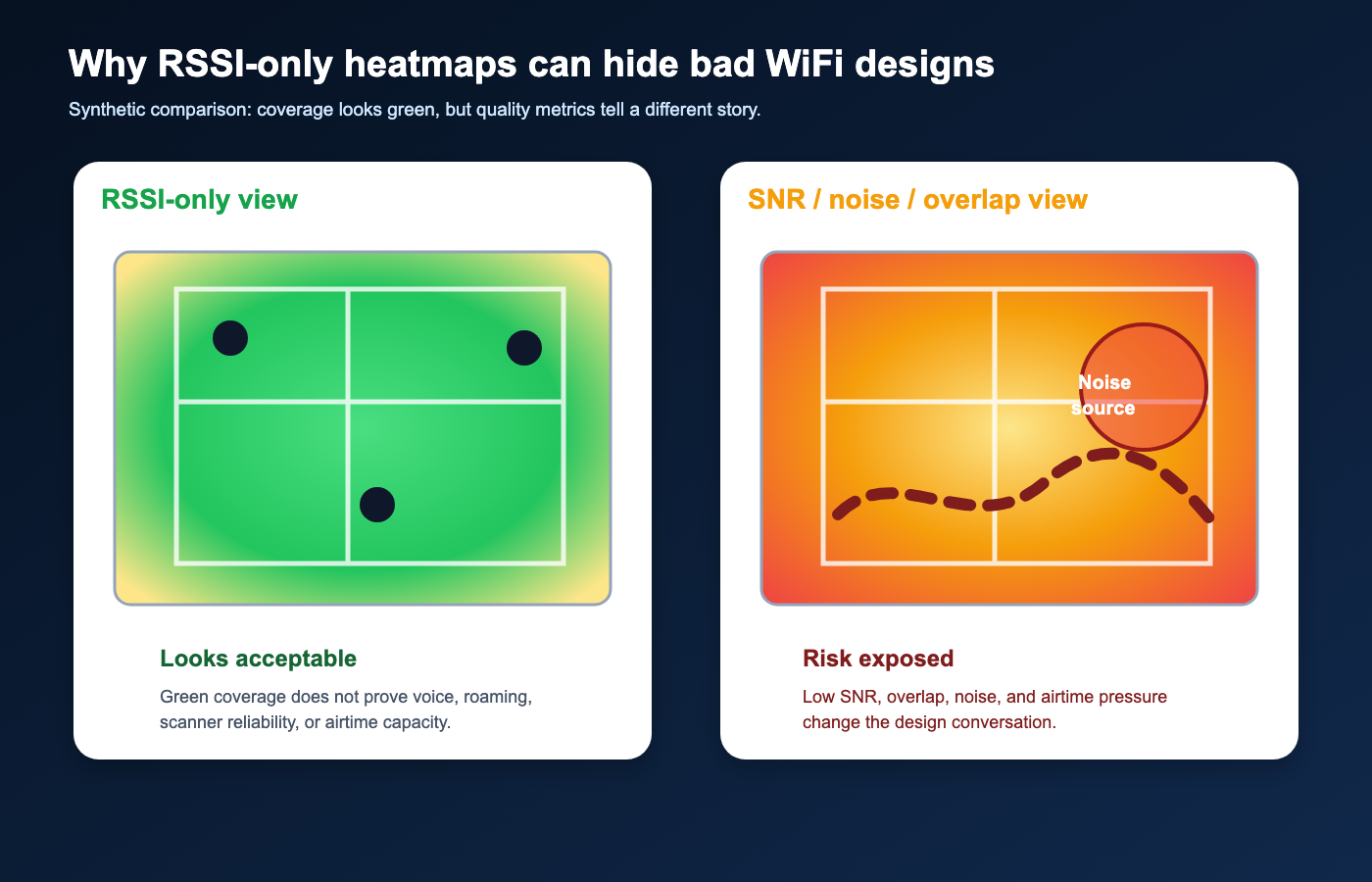
Mistake 4: designing from RSSI alone
WiFi heatmap services should not stop at RSSI. RSSI is only one part of WiFi quality. A network can show acceptable signal strength and still deliver poor performance because of low SNR, high noise, channel overlap, retry behavior, airtime contention, or poor roaming conditions. If the report only celebrates “green coverage,” it may miss the reason users actually complain. This is why a separate guide on how to read a WiFi heatmap report belongs next to any Ekahau deliverable.
For design work, review coverage alongside signal-to-noise ratio, noise floor, channel utilization where available, co-channel and adjacent-channel conditions, secondary coverage, and the client types that must roam through the area. Voice handsets, scanners, tablets, medical carts, POS devices, and laptops do not all behave the same way. Some devices tolerate weaker signal or slower roaming. Others expose every design shortcut.
PacketScout normally treats RSSI as the start of the conversation, not the end. The right question is not “is the map green?” The right question is whether the measured RF conditions support the application and client behavior expected in that part of the building.
Mistake 5: ignoring client devices and application requirements
A survey done for laptops may not validate a design for barcode scanners. A design that works for office browsing may not support voice roaming, latency-sensitive tablets, WiFi calling, or warehouse picking workflows. The Ekahau file should be tied to client requirements before anyone chooses AP spacing or coverage thresholds.
Common differences include antenna quality, band support, WiFi generation, roaming aggressiveness, power-save behavior, supported channel widths, driver maturity, and whether the application retries gracefully when the client pauses. In warehouses, handheld scanners and vehicle-mounted terminals often need more conservative roaming and coverage assumptions than a modern laptop. In offices, video calls and dense conference rooms require capacity planning, not just coverage.
Before field work, define the critical clients and the worst-case areas. During review, ask whether the survey and report prove the design for those clients. If the answer is vague, the design is not ready.
Mistake 6: surveying the wrong building condition
RF changes when the building changes. A warehouse surveyed with empty racks will not behave like a warehouse full of inventory. A school surveyed during a quiet break may not match a full classroom day. An office surveyed before tenant build-out may not include the glass, furniture, conference-room doors, TV displays, people, and devices that will shape the final RF environment.
Sometimes the only practical option is to survey before occupancy. That is fine if the report states the limitation and the design includes conservative assumptions. The mistake is pretending the empty-building survey is final proof of performance. A post-install validation survey may still be needed once the space is loaded, operating, and using the intended client devices.
Good reports do not hide these conditions. They document when the survey was performed, what was present, what was missing, and which areas need validation later.
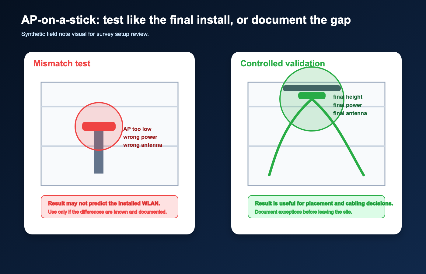
Mistake 7: treating AP-on-a-stick results as final without matching the install
AP-on-a-stick survey work can be extremely useful, but only when the test AP resembles the final installation. If the temporary AP is at the wrong height, wrong orientation, wrong antenna, wrong power, wrong channel width, or wrong mounting location, the measurement can produce a misleading design.
A temporary stand in the middle of an aisle is not the same as a ceiling-mounted AP near steel, ductwork, racks, sprinkler lines, or a high-bay structure. A test at maximum transmit power does not prove a clean roaming design. A test with an omnidirectional antenna does not prove the behavior of a directional or external-antenna install.
When AP-on-a-stick is used, record power, band, channel, antenna, mounting height, orientation, temporary location, and known differences from the expected install. The notes matter as much as the heatmap.
Mistake 8: confusing predictive design with measured validation
Predictive design is valuable for planning AP counts, cabling paths, and budget direction. It is not the same as measured validation. The predictive model depends on wall materials, attenuation values, floor height, ceiling structure, rack contents, AP models, antenna patterns, and assumed client requirements.
The mistake is copying a prediction into a final report without verifying the assumptions. If the model says a wall is drywall but the building has concrete, metal-backed insulation, elevator cores, fire doors, glass partitions, cooler panels, or heavy shelving, the design can be wrong before it is installed.
A good process uses prediction to plan, onsite measurement to validate, and post-install survey work to confirm that the deployed network behaves the way the design intended.
Mistake 9: skipping active tests and real application checks
Passive RF measurements show what is in the air. They do not automatically prove that authentication, DHCP, DNS, routing, roaming, voice, scanning, or cloud application behavior works the way users need. A survey can show strong RF while the user experience is still broken somewhere else in the path.
For many projects, active testing should be part of the work: associate to the SSID, verify IP behavior, test throughput where appropriate, check roaming paths, and test the application or device category that matters. This is especially important for scanner workflows, voice, guest networks, segmented networks, and sites where the complaint is “the WiFi drops” rather than “coverage is weak.”
The right level of active testing depends on scope. The key is not to let a heatmap become a substitute for checking the actual service the users depend on.
Mistake 10: using cosmetic heatmap settings to make the report look better
Heatmap colors are controlled by thresholds, visualization settings, selected bands, selected APs, selected requirements, and sometimes by what the report chooses to show. A green map can be created by using easy thresholds. A scary red map can be created by using strict thresholds without explaining why.
The report should make the requirement visible. If the project needs voice roaming, scanner reliability, dense conference rooms, or warehouse inventory workflows, the threshold should match that requirement. If a page shows only 2.4 GHz or only 5 GHz, say so. If 6 GHz is part of the design, show how it was handled. If a map excludes interfering APs or non-target SSIDs, explain that choice.
A useful report is not the one with the prettiest colors. It is the one that lets a decision-maker understand what was measured, what requirement was applied, and what action should be taken.
Mistake 11: failing to capture notes, photos, and field exceptions
The most valuable information in a survey is often not visible in a heatmap. A locked room, blocked aisle, unusual wall, temporary construction area, suspected bad AP, client complaint, power limitation, cabling constraint, or rack layout note can change the design recommendation.
Survey notes and photos create the bridge between RF data and a real implementation plan. They explain why a path was skipped, why an AP should not be placed in an obvious location, why a room needs validation later, or why a scanner issue may be related to roaming rather than coverage.
If the final report has no notes, no exceptions, and no photos, the client may get a map but not the operational context needed to fix the network.
Mistake 12: not turning survey findings into design decisions
The final mistake is stopping at measurement. A survey should lead to decisions: AP placement changes, channel-width changes, transmit-power changes, cabling recommendations, controller configuration review, roaming requirement adjustments, follow-up validation, or a clearer statement that the RF layer is not the root cause. That is where wireless network design services and survey interpretation overlap.
A good Ekahau deliverable should answer practical questions. Where should APs move? Which areas need additional APs? Which areas need fewer or lower-power APs? Where is the channel plan creating co-channel contention? Which areas need a post-install check? Which client types are driving the requirement? Which findings are urgent and which are design improvements?
This is where PacketScout positions the Field Notes layer: not as generic WiFi theory, but as a practical explanation of why survey process quality affects installed network quality.
A practical Sidekick field workflow for avoiding these mistakes
Use a compact Sidekick field workflow before trusting the final Ekahau file:
Use the Ekahau Sidekick field workflow guide as the procedural companion to this mistake checklist.
- Prepare the floor plan and verify scale before walking.
- Define client and application requirements before choosing thresholds.
- Confirm the Sidekick is ready, charged, connected, and appropriate for the bands being surveyed.
- Choose the collection mode that matches the building and the surveyor’s ability to stay aligned with the map.
- Walk critical areas deliberately instead of relying on interpolation.
- Add notes and photos while still onsite.
- Inspect the path, obvious dead spots, and questionable measurements before leaving.
- Tie the report back to design actions, not just heatmap screenshots.
Use the downloadable checklist below as a practical companion for rental customers, onsite survey preparation, and hybrid review engagements.
Printable checklist
Download the Ekahau Sidekick Pre-Survey Checklist
Planning to rent a Sidekick or walk a site with your own team? Use this checklist before you leave for the building and again before you leave the site.
When PacketScout should be involved
If the site is small, low-risk, and the team has a clean floor plan, PacketScout’s rental path can make sense. The customer can collect data with the right checklist and then use the Field Notes library to avoid obvious mistakes.
If the site is a warehouse, multi floor office, high-density space, healthcare environment, school, scanner-heavy operation, or any network where downtime has a direct cost, done-for-you survey work or a hybrid review is safer. The value is not just the Sidekick. The value is knowing what to measure, where to walk, what to ignore, what to document, and how to translate findings into a design that can actually be installed.
For PacketScout, this kind of technical article supports both paths. It helps rental customers do cleaner work, and it shows why serious design decisions deserve professional survey review.
FAQ
Can an Ekahau heatmap look good but still support a bad WiFi design?
Yes. If floor plan scale, survey path, client requirements, RF metrics, or field notes are weak, the heatmap can look polished while the design is still risky.
What is the most common Ekahau survey mistake?
The most common pattern is treating RSSI coverage as the whole answer. Real design review should include SNR, noise, channel conditions, client behavior, notes, and application requirements.
Should Ekahau Sidekick users follow a checklist?
Yes. A Sidekick checklist helps verify floor plan scale, survey mode, walking discipline, notes, photos, active tests, and onsite review before leaving the building.
Need the survey file to support real design decisions?
PacketScout can help with done-for-you WiFi surveys, Ekahau Sidekick rental workflows, and hybrid review when your team collected the data but wants a second set of RF eyes before committing to AP placement.